last.fm Login Page Redesign
Oct. 28, 2024

last.fm is the world's largest online music service. The existing login page is below:
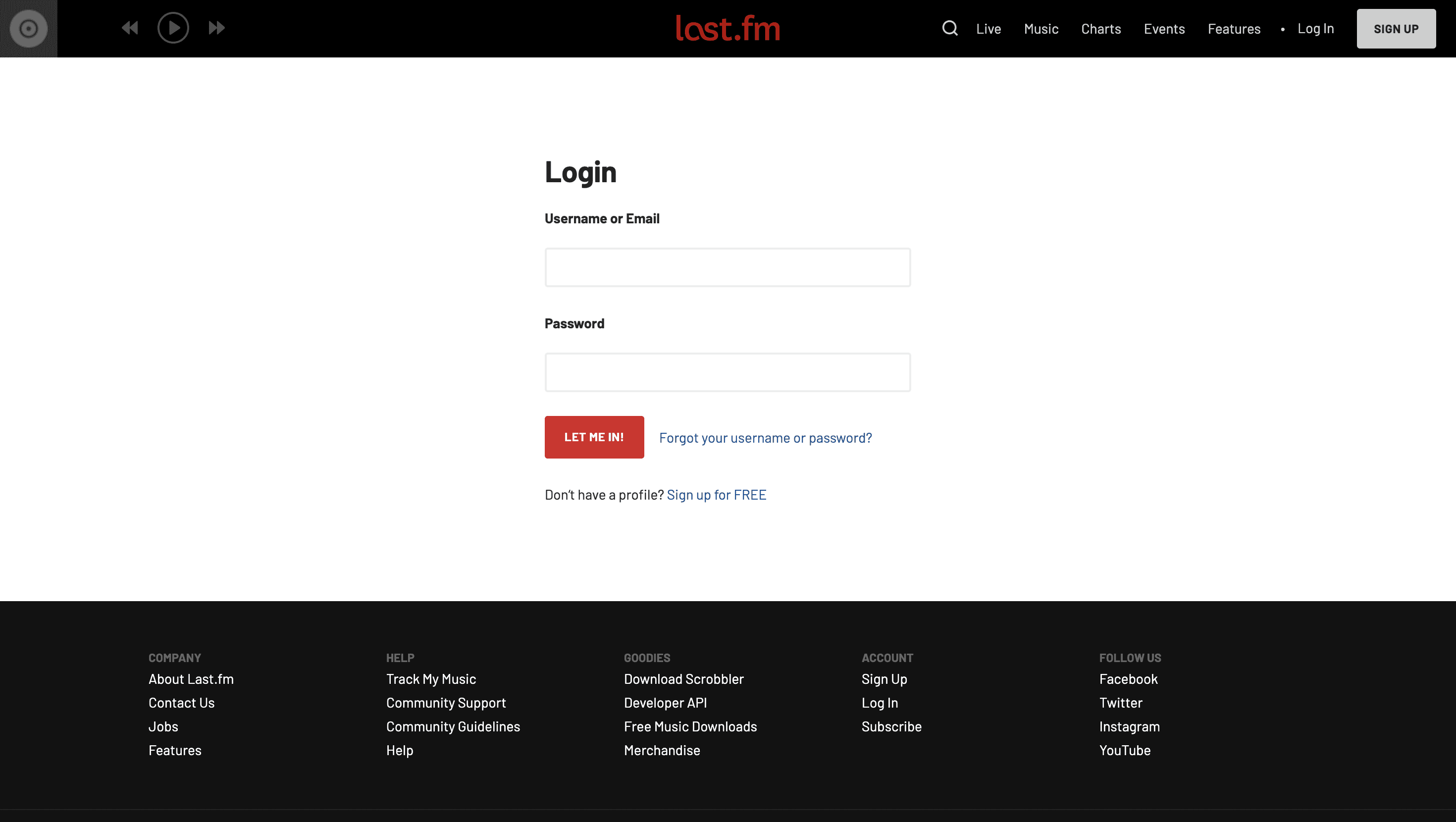
last.fm's login page as of Oct. 2024
Pain points:
Aggressive Button Contrast & Message
The login button's capitalized text ("LET ME IN!") and contrast are visually aggressive. Similarly, the "Sign up for FREE" link is unnecessarily capitalized.
Poor Visual Hierarchy
The "forgot your username or password" link is placed after the login button rather than under the password field. Also, the fonts are not differentiated enough to mark the user flow.
Excessive Whitespace
The login screen is too sparse and lacks visual elements, making the login form seem small.
Footer Overload
The login page's footer is cluttered with too many links and the backdrop needlessly uses more than a third of the viewport.
Draft Prototype:
User-centered Redesign:
Album Collage Background
A blurred visual collage of the highest-rated RYM albums of all time to the right of the login form emphasizes the theme of music and the listening experience. The reduced opacity and blur ensures the focus remains on the login screen.
"Sign in" Button
The redesigned sign in button has a more passive message with softer contrast that also matches the color scheme
Link Rearrangement
The "forgot username or password" is positioned in accordance with the visual hierarchy.
Footer Revamp
The new footer has the essential links and takes up far less space space on the viewport.
Feedback:
Album Collage Uses Too Much Space
"The album collage takes up almost half of the screen. Think about what you are trying achieve with your design"
Links Don't Seem Clickable
"The 'Forgot username or password' and 'Sign up for free' buttons don't stand out as clickable."
Final Prototype:
Final Redesign:
Resized Album Collage
I reduced album collage to about 33% of background space so the focus between the login items and music is balanced.
Making Links Look Clickable
I adjusted the shade of blue to increase contrast and make the links look clickable.